
An ad that introduces your orthodontist needs a different message from an ad asking someone to contact the practice about care. Before choosing the photo, filming the opening or writing a headline, decide what you want the viewer to understand and do.
These three examples come from our published practice work: a historical Stuart Dental Spa video opening and two Power Orthodontics awareness ads. They show different creative choices. The useful question is what you can learn from those choices for your own practice.
Stuart Dental Spa: start with a concern the practice can address
The Stuart Dental Spa work page includes a 10-second opening excerpt from a historical Meta campaign. Dr. Tony appears in the practice, speaking directly to camera. An on-screen caption identifies the local audience, and captions carry the opening message.
The creative addresses people who have put off finding a dental home, with cost as the concern behind the conversation. That gives the opening a specific subject. A viewer can quickly work out why the message might matter to them.
The next step needs the same care as the opening. If someone wants to ask about care or cost, the inquiry route should let them do that. The team needs to know where that inquiry arrives, who responds and what happens when the person cannot be reached straight away.
For your own video, choose one question your team can answer clearly. Give the doctor a useful starting point and let the answer sound like a conversation. A broad introduction to every service can leave a short ad with too much to explain.
Before adapting a historical ad, check its message, any offer details and the contact destination with the practice. Use the excerpt to study the opening, then plan the inquiry route as a separate part of your own campaign.
Power Orthodontics: make the doctor familiar
The first Power Orthodontics example uses a portrait of Dr. Rebeca Power, the practice logo and a short message: “Meet Dr. Power. Your Stuart orthodontist.”
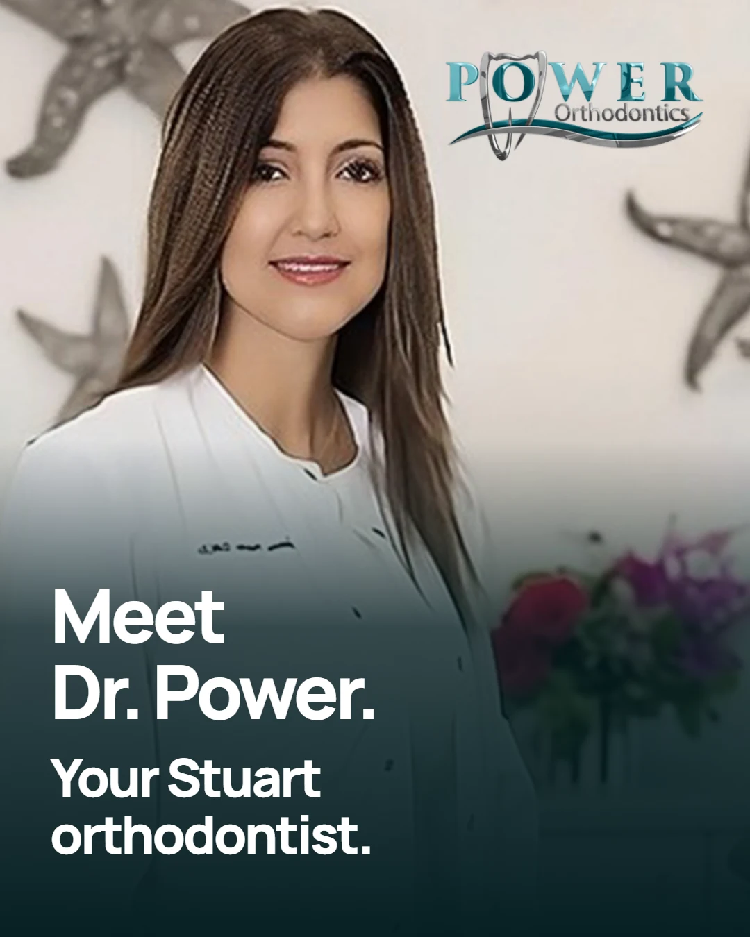
The photograph and headline work together. You can see who the ad introduces, which practice she belongs to and the local connection. The creative gives those details room instead of asking the image to carry a long service list.
This was part of a local awareness campaign. Its purpose was to introduce the practice to people in the area. That purpose should guide how you judge the creative and the campaign's reporting.
For a doctor introduction, check the name, role and location before worrying about a clever headline. Use a photograph that represents the person patients will meet. At a phone-sized view, the face and main message should still be easy to understand.
A short message can also give you a useful starting point for later creative. A separate piece can explain a service or answer a common question without crowding the introduction.
Power Orthodontics: show the people behind the practice
The second Power ad uses a photograph of six team members in the practice. Its headline reads, “A local team. A welcoming space.”
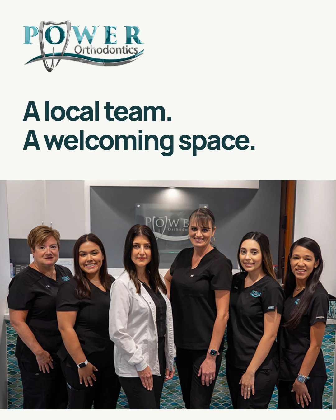
The image supports the message directly. The people and setting are visible, so the headline has something concrete behind it. It helps a viewer begin to recognize the practice before a visit.
The doctor and team ads share the same visual style, but each has a distinct focus. One introduces Dr. Power. The other brings the wider team into the picture. Matching feed and vertical versions were prepared for the campaign.
For your team creative, start by checking whether the photograph reflects your current practice. Look at who appears, the setting and the way the image crops in each planned format. A group photograph that looks clear on a desktop can lose faces or useful context in a smaller placement.
The video and content service can support this kind of practice introduction. The photographs, footage and final formats should follow the agreed project.
Give the creative a matching destination
Someone who clicks should be able to continue the same conversation. A doctor introduction can lead to a relevant practice or doctor page. A service-focused message needs a destination that explains that service and makes the next step clear.
Review that route on a phone. Can you read the page, find the contact option and understand what you are being asked to do? If there is a form, check what the office receives and how the response is assigned.
These decisions belong in the campaign brief alongside the creative. Our Facebook and Google Ads service explains how we agree on the message, budget and inquiry handoff before launch. Current management options are on the packages page; advertising spend is separate.
Measure the outcome you asked for
Keep the stages clear when you review a campaign:
- Reach and views describe exposure to the creative.
- A page visit shows that someone reached the destination.
- An inquiry needs an actual contact or accepted submission.
- A booking needs confirmation from the practice's scheduling record.
When comparing ads, record the purpose, audience, format, destination and reporting period. If several things changed at once, a different result will not tell you which creative decision caused it.
The next useful ad is the one that answers a clear practice question and gives the office a workable next step.